TIGRON
"Ready to play with fire?"
Being the launch title for the Playstation in Europe, the game wipE'out" not only helped launch Sony's first foray into the gaming market, but also marked the start of the now cult racing series. Its futuristic look, the mesmerising music and the incredible sense of speed set it apart from other games. It is therefore no wonder that the franchise received a new entry for every subsequent system from Playstation. And in 2017 Sony remade two previous games, wipEout HD and wipEout 2048, and released them as part of the wipEout Omega Collection. As part of a collaboration with Playstation DACH, I created LEGO® versions of three prominent ships from the series. All of them have fully illustrated instructions, which you can download at the end of this page.
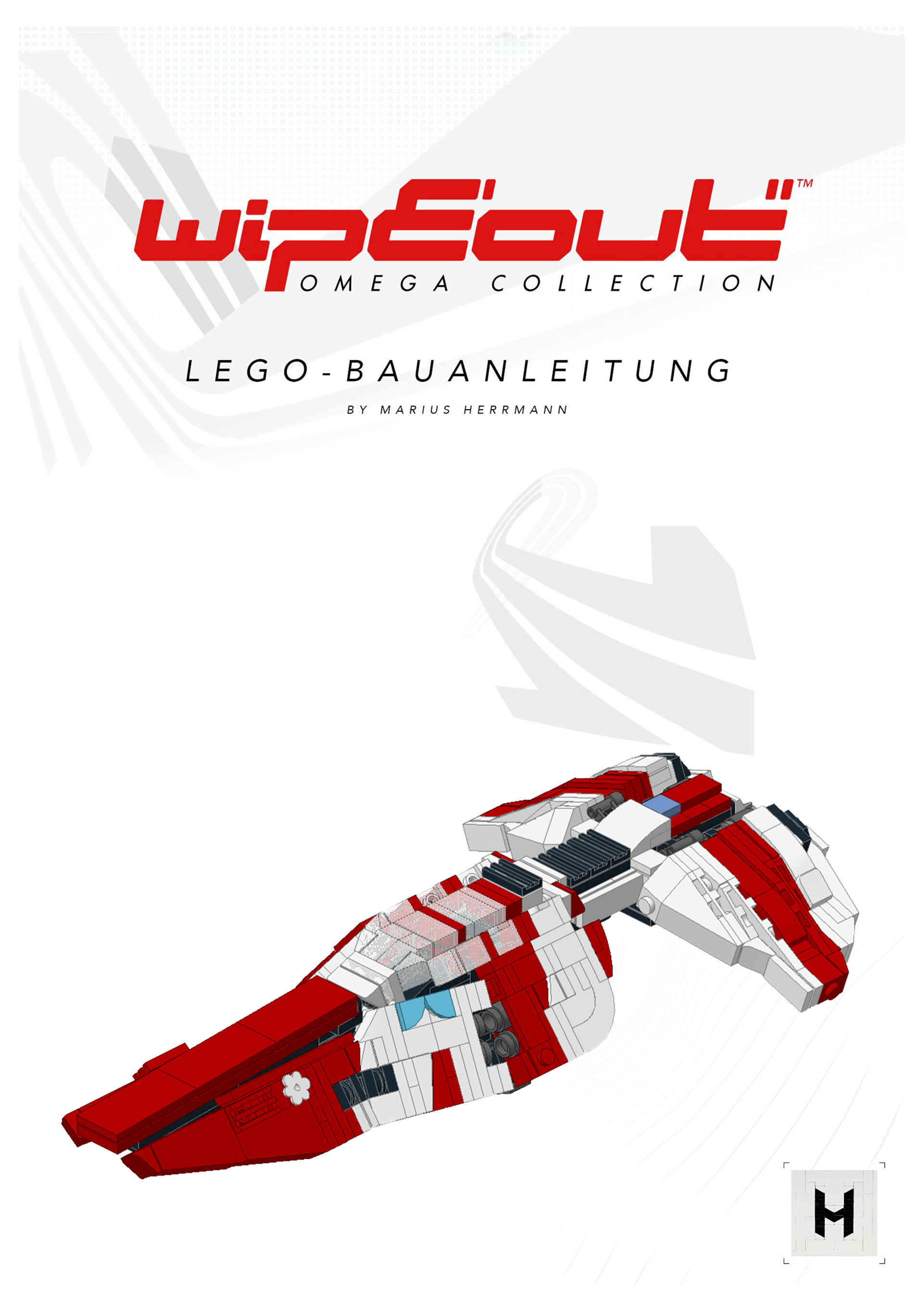
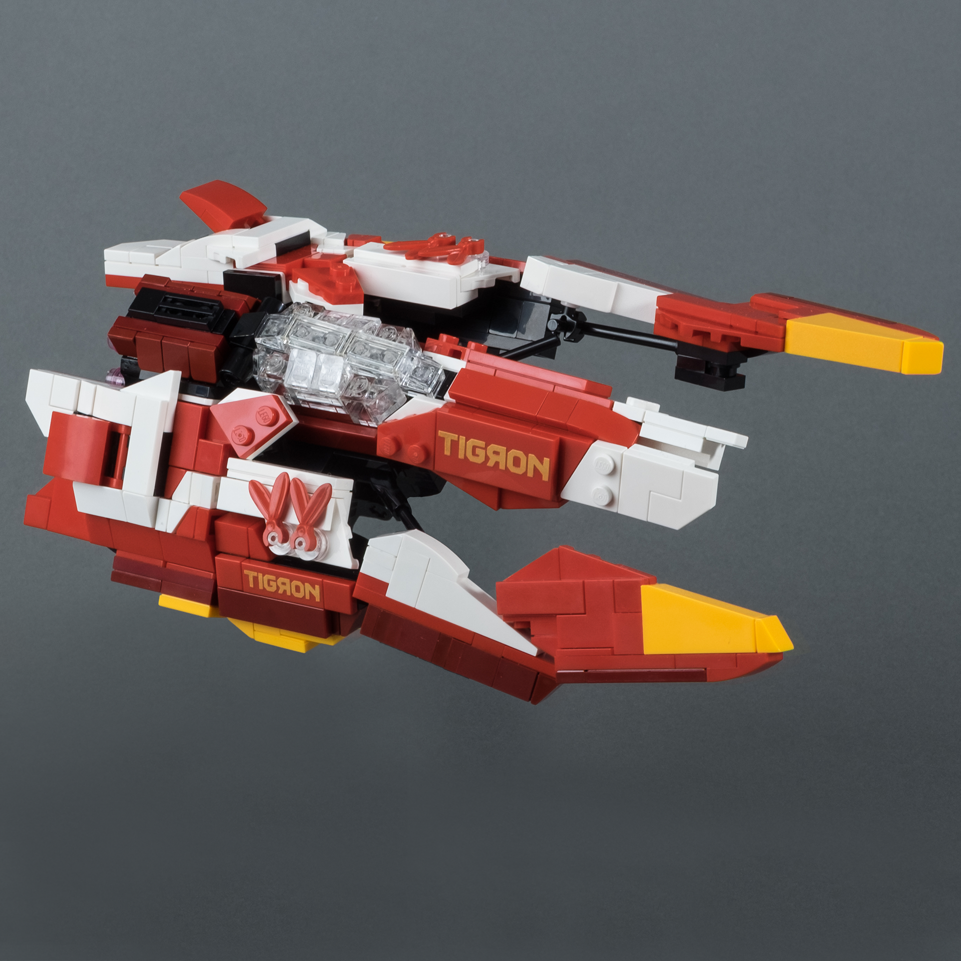
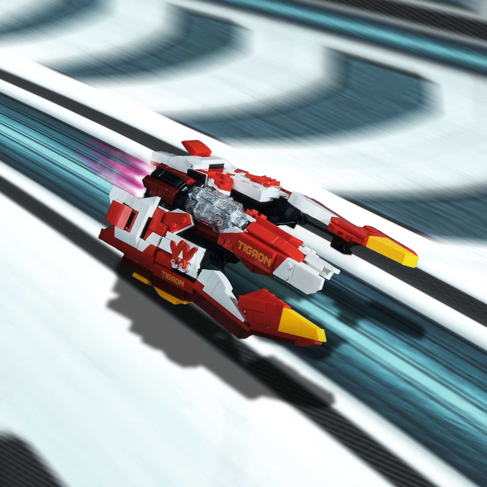
When deciding which ships to remake as a LEGO® model, the Tigron K-VSR was a given. This ship was newly designed for the wipEout Omega Collection and was featured prominently in the marketing for the game.
The Tigron was also the easiest to build in LEGO® and the first of the three ships I created. The angular panels as well as the straight color splits render it perfect for this medium. Its color palette of red, dark-red, white and yellow also allows for the use of a great variety of pieces. The aggressively shaped forward arms as well as the prominent livery make the Tigron K-VSR one of my favourite racers and the most fun to put together.
Since it was agreed upon that all ships should come with instructions, the complexity of the build and the number of parts had to be limited. To keep the shapes of the originals intact, the use of large LEGO® cockpit glasses was not possible at this scale. Instead, the cockpits were built with trans-clear bricks, which made it impossible to fit a minifigure inside. This is one of a few sacrifices that had to be made for the sake of accuracy. One highlight of the model are the Tigron logos on both sides which were created using LEGO® feathers (Part-ID 471).
AG-SYSTEMS
"コウリョクナトモダチヲツクレ"
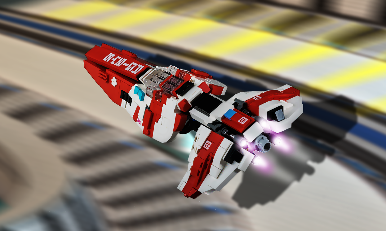
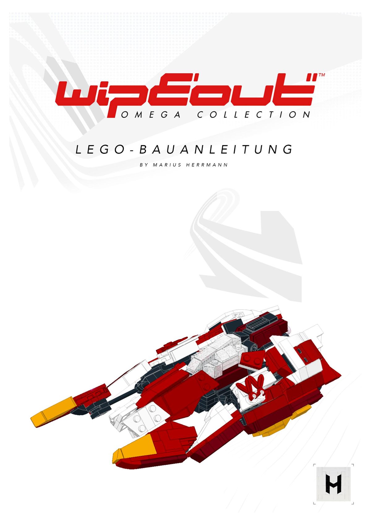
The AG-SYSTEMS is maybe one of the most recognisable ships from the wipEout-franchise, since the racing team has been part of the competition since the very first game. Additionally, the ship itself has stayed mostly true to its shape introduced in wipEout 2097, the second game of the series. And from wipEout 3 onwards the look of the AG-SYSTEMS racer has remained almost identical.
Because the craft is that iconic, it was important to me to replicate its styling as closely as possible. To get the shaping of the LEGO® model right, the sides of the main body were hinged on three different points each. This allows them to taper at the front while maintaining a simple construction. That also meant that the sides needed to be segmented into three different panels, which together give the illusion of one smooth surface. Combining them with the right spacing was difficult, but made incorporating the classic red-white livery a lot easier. Since the entire ship was built around one solid centre stripe, stability was not a problem.
In-game model of the AG-SYSTEMS from "wipEout HD"
Staying true to the original
Compared to the other ships from the wipEout-universe, the sponsor and team logos are a more prominent feature of the AG-SYSTEMS design. Most notably are the team lettering at the front of the vehicle and the AG logos on the back wings. A number of additional logos are featured as well, one of my personal favourites being "Joy Noodles", a fictional fast-food restaurant, the logo of which is prominently displayed on the AG-SYSTEMS. Recreating those with LEGO® in such a small scale is not really viable, thus most of them are printed onto the parts.
However, some of the markings, such as the white (Colour-ID 1) circle on the side, the red (5) stripes as well as the medium azure (156) AG logo are alluded to in brick form. A mix of printed and brick-built livery give the model a unique and sharp look.
FEISAR
"Race for E-Unity"
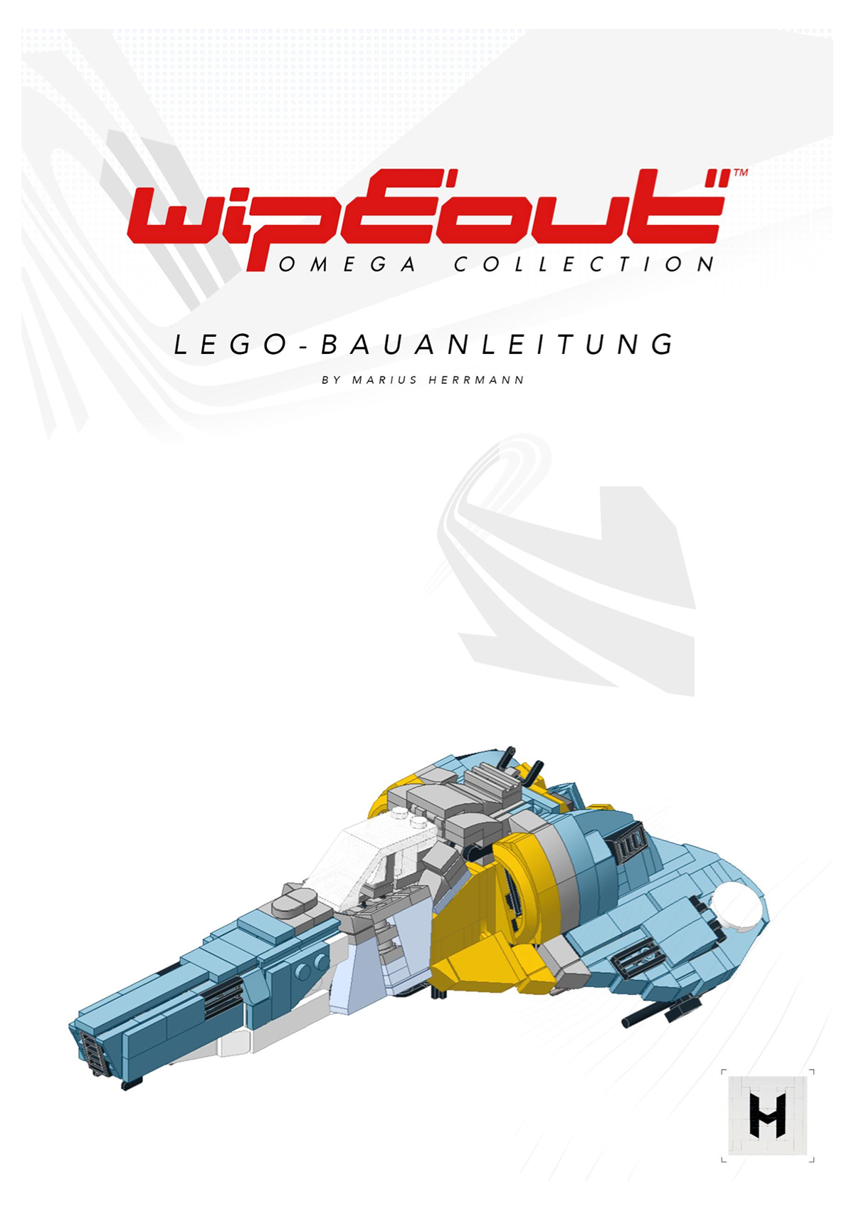
The Federal European Industrial Science and Research, or FEISAR for short, is the titular team of the wipEout-series and one of the most popular ones. So it was a no-brainer that one of the LEGO® models to be created should be the Feisar ship from wipEout HD. This proved to be the most difficult model to design for multiple reasons.
Just like the AG-SYSTEMS, the FEISAR has stayed rather close to its design from wipEout 3. The two main changes over time were the colours of the vehicle and the proportions of the wings and front section. In the newer instalments of the series the ship has a smoother and curvier shape compared to the more angular design in the older games. The amount of logos has also significantly increased. All these aspects made the transition into a LEGO® model quite challenging.
Blue is not simply blue
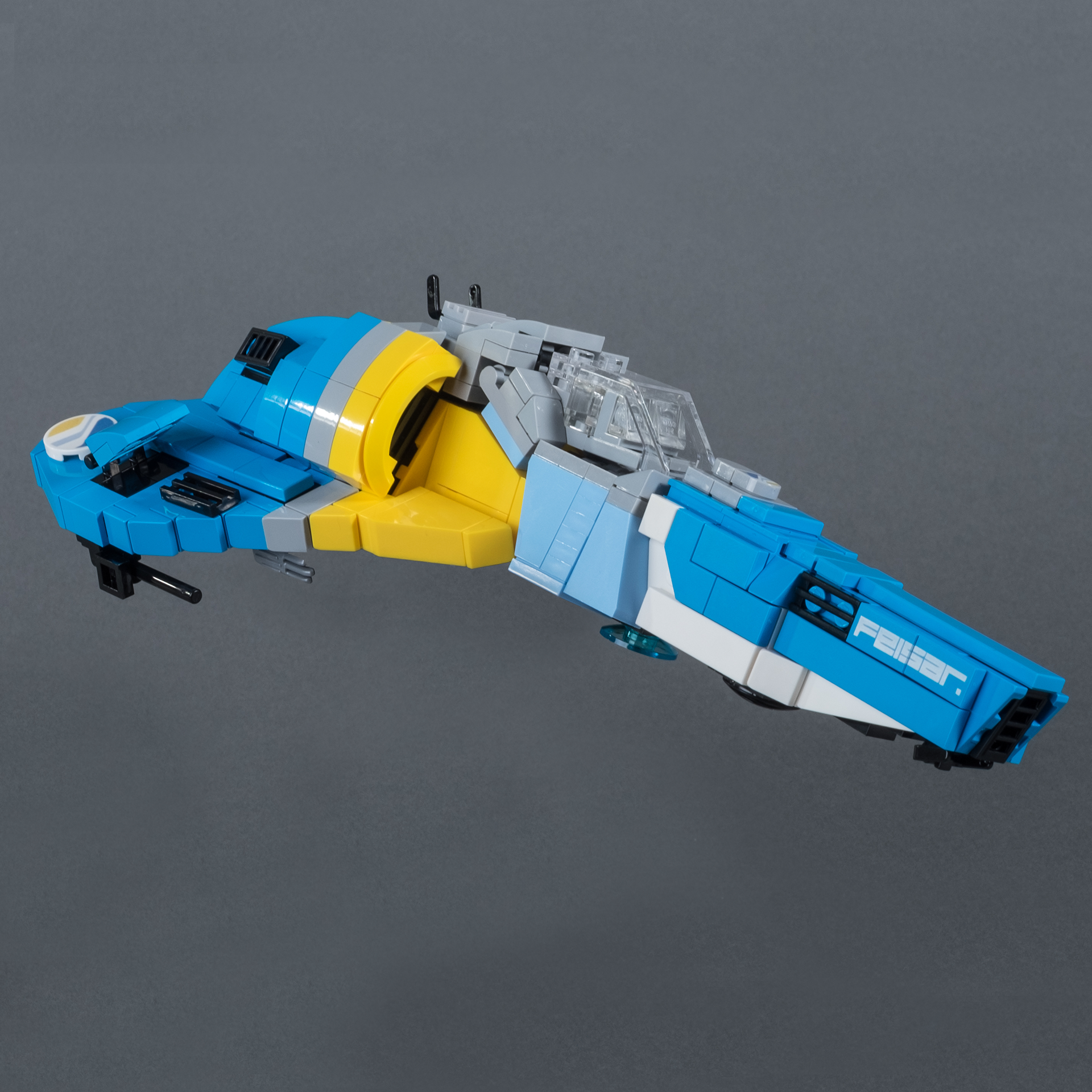
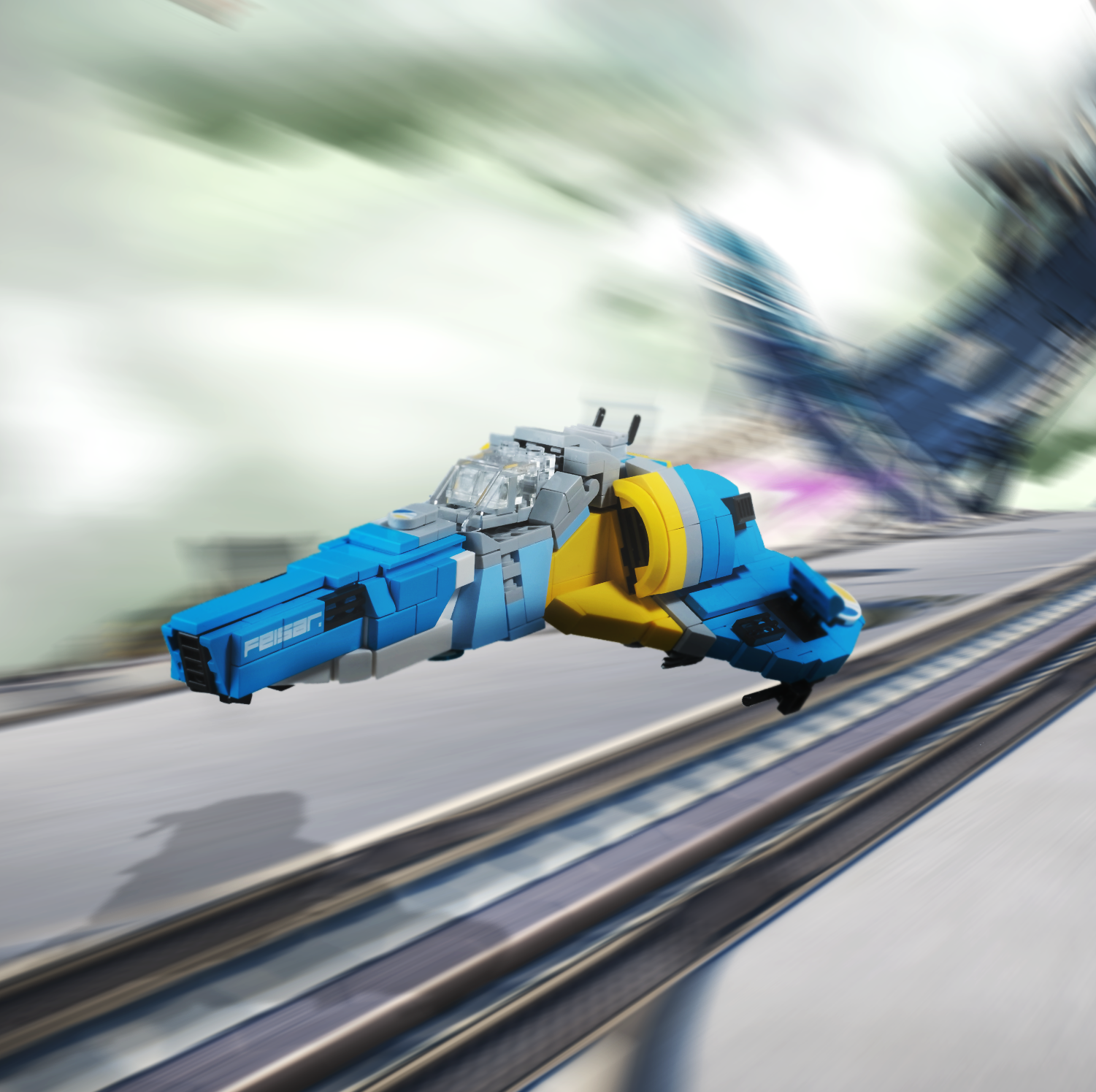
The first major decision that had to be taken regarded the colours to be used. The LEGO® group offers are large variety of blue shades: From the standards bright blue (Colour-ID 23), medium blue (102) and dark blue (140) to lighter tones like medium azur (322). But the tones which represent the new FEISAR colours the best are dark azur (321) as the main colour and light royal blue (212) for the details. The variety of bricks, especially slopes and wedges, is very limited for those two hues. For the FEISAR specifically it was more important to get the colours correct than to have access to the entire LEGO® brick library.
Finding the right shape
Having chosen suitable colours to use, the next step was approximating the shape of the FEISAR with the bricks available. This was not only difficult because of the sweeping design of the ship but also due to the colour splits of the livery.
The design of the cockpit as well as the engines was easy to replicate using specific parts like a cockpit glass (Part-ID 6070) and yellow wheel arches (98282). The pointed front section and the wings were more difficult to build. After trying out different techniques for both, I decided to focus on the colour alterations rather than on smoothing the surface of the vehicle. This yielded the added benefit of creating flat surfaces for the letterings to be printed on.
Unfortunately, some of the iconic elements such as the "MAGEC" and "Tap Energy Drink" sponsor logos could not be printed on the side of the ship, as they would have covered multiple bricks. Still, the bright colour palette and the added FEISAR signature give the model a striking appearance.
Join the race!
Download the Instructions for all three wipEout ships and build them yourself
